When Andy Bezek purchased his father’s dental practice, he wanted to start fresh with a new brand—while still carrying forward 35 years of trusted dentistry.
Bezek Family Dentistry offers general and preventive dentistry with a wide range of services. Over the years, the practice has earned a reputation for providing quality, low-pressure care by empowering clients to make informed decisions about their dental health.
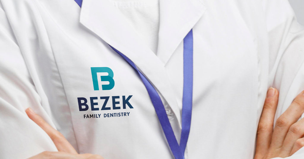
Andy wanted his new logo to have a clean, contemporary feel, while still evoking the trust and empowerment his father had built into the brand. He wanted to stay away from typical dental imagery and instead make the initials of the practice the focal point.
The logo we created features all three letters of the brand name. Incorporated in the “B” is the letter “D.” The negative space creates the letter “F.” We chose a color scheme that evokes a fresh dental experience.
The overall feel is simple, inclusive and modern, while still providing interest and depth.
Andy loves the final results.
“Gearbox was the perfect company to create the logo for my dental practice. They took the time to understand what I was looking to convey, and used their creativity to put that into the design. I could not be happier with the results.”
If your logo needs a transformation, we can help you shift gears. Connect with us!