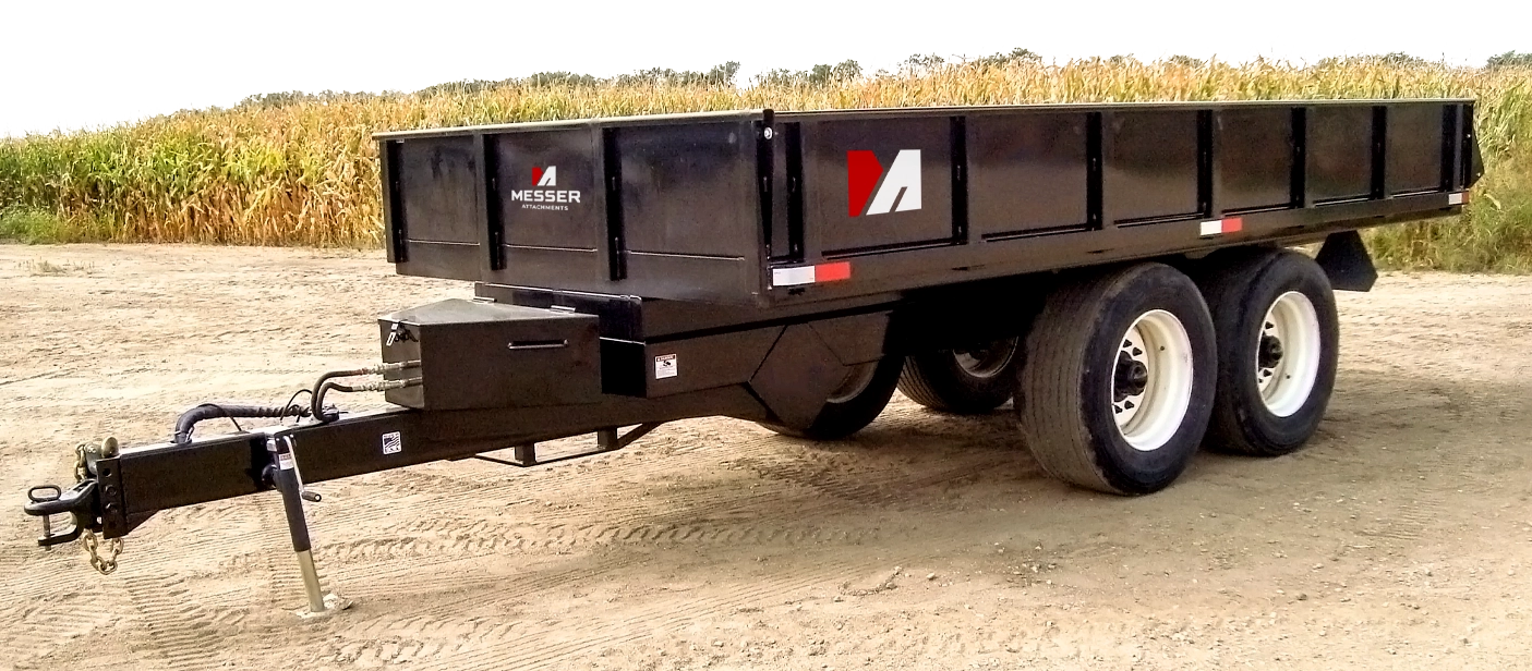
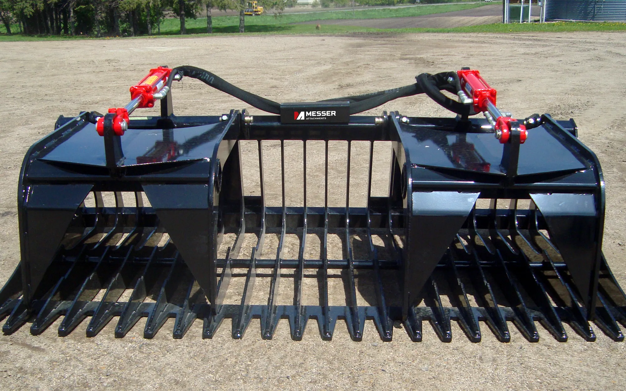
Messer Repair & Fabricating had evolved since the business began. Over time, the company had moved away from repair work and instead focused primarily on creating high-quality farm attachments. To accommodate the shift, Messer needed a new brand identity that eliminated the MRF initials and focused on the brand equity of the Messer name.
The solution
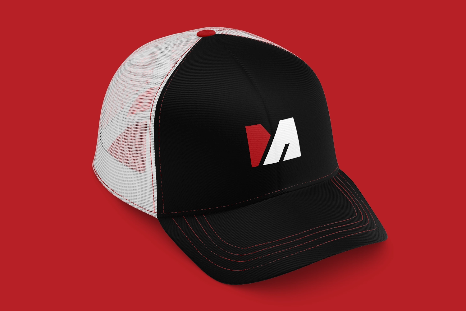
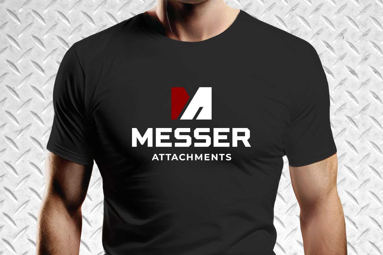
The logo we created features a bi-colored M that incorporates the letter A. The two components represent the connection between the farm implement and the Messer attachments. We chose a strong, bold font to evoke rugged toughness, and a color palette that’s an extension of the original logo.
What we did Logo Design
Previous Logo
New Logo
Jana Messer Messer Attachments
“Gearbox is amazing to work with. They ask questions to help get you what you want and their final product has always been amazing. This is the third time we’ve partnered with them for design and each time they amaze us again! 10/10 would recommend them!”