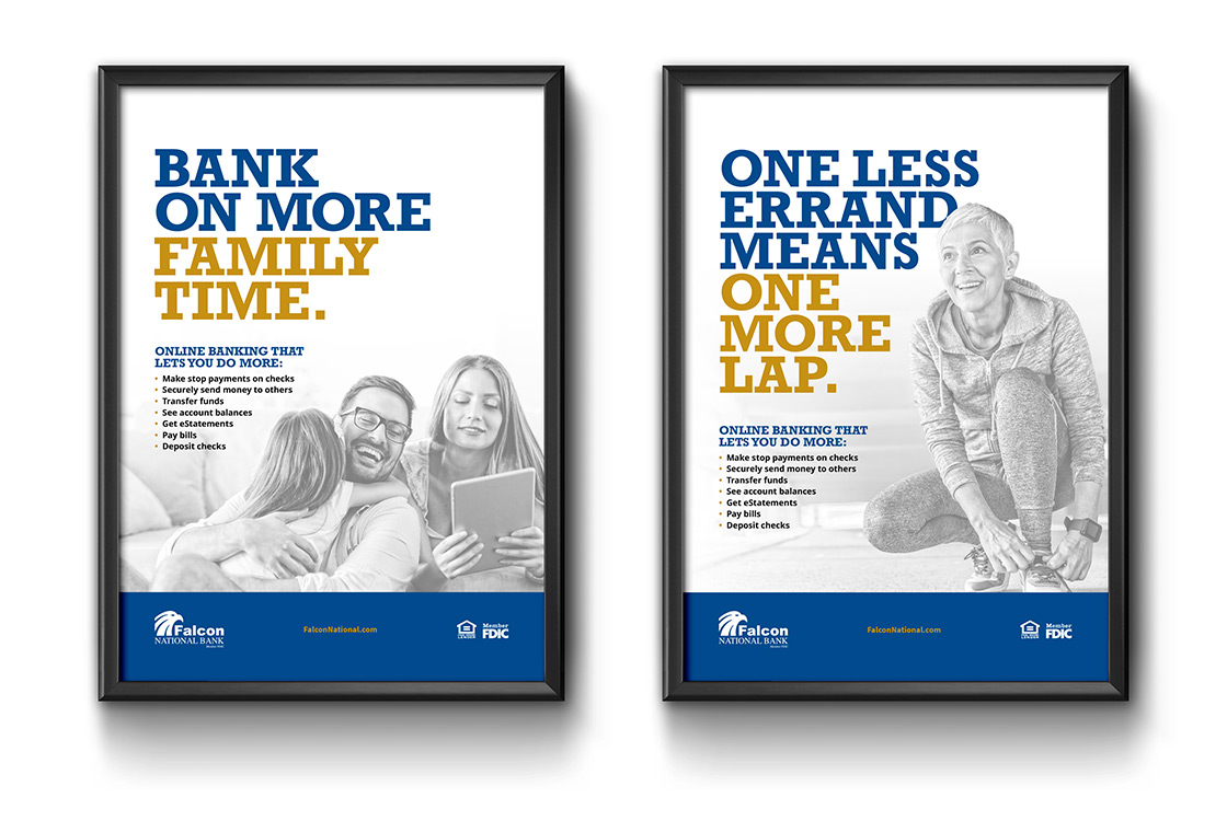
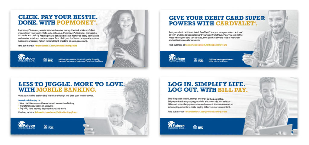
This year, Falcon National Bank went through a number of big changes. In addition to merging five of its banks, it revamped its core technology to bring customers a super convenient online banking platform. To spread the news, Falcon asked us to create a campaign that highlighted all of the new features, but in a slightly different way.
The bank liked its royal blue palette and strong Rockwell font, but it wanted a way to move its brand forward with a fresher, lighter look that better reflected the personality of its services: personal, positive, flexible and convenient.
The result was a campaign that featured gray-scale images against clean, white backgrounds; informal headlines that made convenience the star; and a brighter gold palette that complemented the blue and made room for the brand’s softer side.